Wednesday, August 19, 2009

Just asking for trouble, really

Louise Bourgeois, Sleep II, 1967, marble on two wooden timbers, Tate Modern


'Editing is everything. Writing a first draft is akin to moving a big block of marble into a sculptor’s studio. It’s hard, and it requires some finesse, but mostly it’s just heavy lifting. It isn’t art. The art happens when the marble starts getting chipped away to find the Pieta within. And that is the role of the editor -- with luck, in concert with the writer.'

-- Dan Baum, from 'The State of Editing'


As an editor, I can only admire this statement. As a writer, of course I refute it utterly.

Tuesday, August 18, 2009

Unhomely

I've written before about the way certain artists come to completely own the landscape they live and work in. I can't see photographs of Long Island, for example, without the view rearranging itself into an Edward Hopper painting: I've had Ed Ruscha moments in L.A., driving past anonymous motels and gas stations; in Christchurch in the spring and summer, there are weeks on end presided over by Bill Sutton skies.

William Sutton, Plantation Series II, c.1985, oil on canvas, Collection of Christchurch Art Gallery

There's such a characteristic feeling of uncanny displacement when you come across a scene in the real world that you already know from an artwork. (Probably the most memorable occasion of this for me was entering New York at night for the first time, riding in the back of a yellow cab with steam rising from vents in the road, having watched Taxi Driver 200 times previously at home in New Zealand.) Less often it can happen with objects: I can't see old road signs or enamel-ware now without thinking of Rosalie Gascoigne, or arrangements of wine glasses on a table without recalling Bill Culbert's photographs taken at his home near the Luberon.

These moments when the real world gives way to the artwork are intensely familiar, yet at the same time out of place, transporting you between the actual and the virtual and back again in the blink of an eye. Not only does an artwork motion you towards a particular way of seeing, it also invites you to focus on the kind of singular detail that gets lost in the maelstom of daily life. I think these experiences are among the most rewarding of the art life.

Walking back from school this morning it happened twice.

First I saw a Gavin Hipkins in the park.

Left: Gavin Hipkins, The Homely: Sydney (Flower), 1999, back cover of catalogue.

And then why, I wondered foolishly as it turned out, are they illustrating a Simon Morris painting on a real estate sign? A house of art collectors?

Left: Simon Morris, Protein, 1993, acrylic on aluminium, Chartwell Collection, Auckland Art Gallery Toi o Tamaki. Right: The QR Code on a Harcourts Real Estate sign in Leinster Road, Christchurch.

I'm interested here not only in the way that experiences of the real world are mediated by works of art, but the way in which an encounter with a work of art can be enlarged by seeing its equivalent in everyday life. This traction between the familiar and the strange, the actual and the virtual, is what the experience of a work of art is all about, it seems to me.

Monday, August 17, 2009

Salvage punk, public art division

A new public art work for Christchurch? Taking its lead from the salvage punk aesthetic, and channelling Tony Cragg and Bill Culbert as well as the 'evil spirit-catching' bottle trees of the American South, this installation appeared in a garden near the Elmwood shops over the weekend.


Thursday, August 13, 2009

'Oh no!' they said


The small guy has been at it again: his own version of the Captain Underpants franchise continues its theme of crime and just retribution with a recent excursion into the very topical UFOlogical genre, with the completion of Captain Underpants and the Turbo Toilet 2000 and Professor Poopy Pants and the Zombie Lunch Ladies and the Bionic Booger Boy.

Once at Jerome Horwitz Elementary School George and Harold saw a UFO.
'Oh no!' they said.
It landed in the playground. Out popped Professor Poopy Pants and the Turbo Toilet 2000.
Then another UFO came, and landed on the school. Out popped the Zombie Lunch Ladies and the Bionic Booger Boy.
Then George and Harold got some kids to help.
They got the Turbo Plunger 3000 out.
The villains were scared.
They ran.
To the UFO.
But the door was stuck.
They were sent to jail. The police said 'Thank you.'
The End.

Wednesday, August 12, 2009

Playing on

One of the most recognisable fonts designed in New Zealand in recent years is 'Parihaka', the typeface drawn by Neil Pardington (Kai Tahu), Aaron McKirdy and George Clarke for the exhibition and book Parihaka: The Art of Passive Resistance at City Gallery Wellington in 2001. The typeface was used for the title of the book, as well as for indvidual chapter headings.


Gifted by the designers to the trustees of Parihaka Pa for their use following the exhibition, the font is now used as a logotype for the annual Parihaka Peace Festival in Taranaki.

Via Outdoor Styles.

The font's ancestry is complex. It's based on the lettering hand-painted on the walls of some nineteenth-century Maori meeting houses, which in itself was influenced by printed letterforms remembered from the early missionaries' Bibles. (The painted word has thus been a part of New Zealand art history from very early days.) While Maori communities lived with their treasures daily, it was not until 1993, with the publication of Roger Neich's seminal Painted Histories, that these early works of art were brought to wide public attention. Re-imagined and hand-drawn in a Wellington design studio in 2000, and finally digitised, the ongoing history of what's now known as the Parihaka font describes the way in which design is fundamentally a circular and cyclic process, the passing of a baton back and forth between artists of different generations and places.

Fiona Pardington, Puhi Wahine/Rere Torohai/Ae: I–V, 2004,(Noble Woman/Rising from underneath/Yes, 2004) video installation, 5 LCD screens, dimensions variable. Via Auckland Art Gallery.

I think it's one of the most important examples of New Zealand graphic design produced in recent years: utterly distinctive, at once elegant and engagingly awkward, informal yet painstaking, it speaks of the shared history of Aotearoa New Zealand while resisting categorisation as an antique aesthetic. Neither historical nor modern but something else again, the Parihaka font is essentially a hybrid, a coming together of diverse cultures and technologies.

I've thought a lot about this font over the years, and hence perhaps I'm unnaturally attuned to sightings of it. I was, however, completely astounded to see a version of it appear on Rhys Darby's pop culture TV programme Rocked the Nation the other night, in a sign held up at a rugby game in about 1990, following Wayne 'Buck' Shelford's dropping from the All Blacks' captaincy.

Here's rather a blurry photo I took off the TV, which I think should henceforth enter the ranks of the Parihaka font's various ancestral iterations.

Tuesday, August 11, 2009

Always on my mind

Left: Elvis Presley, c.1971. Right: Colin McCahon,1961. Photographed by Bernie Hill. Courtesy of Gordon Brown © New Zealand Magazines. Via Te Papa.


The latest collaboration between Auckland's Objectspace and Jonty Valentine (curator, writer, graphic designer, and academic) is an exhibition and book entitled Printing Types: New Zealand Type Design Since 1870. It's an important event, representing the first attempt to trace the unwritten history of New Zealand's type designers (the people who draw the original letter forms to be made into fonts, rather than typographers, who arrange the type on the page), and includes not only the typefaces but interviews with and original writing from the type designers themselves. There's Joseph Churchward and his 'plumpy' Marianna font; Tom Elliott's Air New Zealand logotype from 1968; Bruce Rotherham's elegant 'Wedge', begun in 1947 and finally completed four decades later.

There's also an extremely interesting article by Luke Wood, discussing the evolution and subsequent dissemination of his 'McCahon' font, a process which he likens to Frankenstein's monster being unleashed on the world. It's a fascinating account, which describes the appropriation of handpainted lettering from informal advertising on farm gates by Colin McCahon, to Wood's digital rendering and publication of the font resulting in a series of unauthorised uses for advertising, to its recent adoption by a juice company to signify 'honesty' and 'down-to-earthness' in its product range, mimicking the original farm gates which inspired McCahon. 'And so,' writes Wood, 'as if through some sort of voodoo or dark magic, McCahon is returned to his point of departure.'

Printing Types is all great stuff, and makes an important contribution to the history of New Zealand's visual culture: but it would be worth acquiring for this quote alone, which, albeit written by a graphic designer (Wood), may be one of the great lines of New Zealand art history.

'And then of course there is Colin McCahon. Who, like Elvis, casts a sort of posthumous shadow over everything.'

Can't believe I didn't think of that one myself. In the spirit of McCahon-ish appropriation, I certainly intend to use it.

Thursday, August 6, 2009

A feeling for beauty

Toss Woollaston, Sunset, Grey River


'What a beautiful sunset!' said the small guy, who's started noticing such things, as we drove to the library this evening.

'How would you describe the colours?' I asked (he's doing adjectives at school).

'Greyish blue like a whale -- in fact, that cloud looks like a whale smoking a cigarette while it's eating a salmon -- and butt-cheeks pink.'

Art history, Koons-style

Jeff Koons, Girl with Dolphin and Monkey (The Whitney Museum of American Art 75th Anniversary Photography Portfolio), 2006, chromogenic crystal archive print.
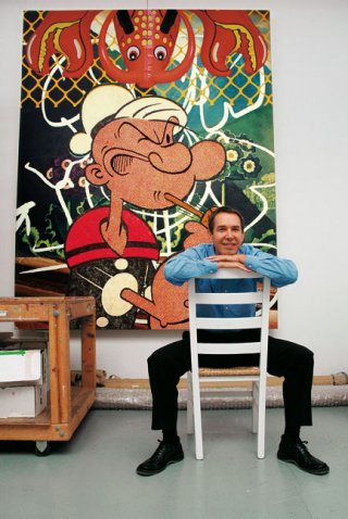
'I’m so involved in contemporary art myself that I’m much more interested in art from a different time. I have a little bit of a sense what it’s like to be alive today, to try and make work today, so contemporary art isn’t so important to me. I’m more interested in what it meant to be alive, to be trying to make art, in other times, in a very different culture.'


Jeff Koons in front of Popeye (2003, oil on canvas) at his Chelsea studio, New York 2003. Photo: Catarina Åström.

'Each of these broad sweeps is hand-painted with very small brushes, we never use sponges or anything larger. The whole art work is a gesture and all these gestures are about doing something with your life, about what you really want to do. This is very fluid, at a distance you can see the imagery, but up close it is very abstract. They’re about [the] history of European art. I love it when there’s a revelation in art, when you see things you have not seen before, connections that you make yourself, not that you’re supposed to make, when those things are there for you. There are French 19th-century brushstrokes we’re painting alongside the Magic Marker lines ... they really work together.'

Both quotes are Jeff Koons, interviewed by Adrian Dannatt in The Art Newspaper.

Wednesday, August 5, 2009

Signs to live by


Yesterday I flew to Auckland to farewell a dear friend. I think funerals are private affairs, so I'll just confine myself to saying that the commemoration was as warm, as funny, as packed with people, as surprising and yet as straightforward as befitted the intensely well-lived life being celebrated.

In moments of heightened emotion, or at times of some kind of historical import, I often find myself looking around for some kind of object or image to fix on, something that will provide an anchor point in my memory for the events of the day. Writing it in my head, I suppose, before it's even done. Significant moments always seem surrounded and heralded by signs in the physical world: equivalences, perhaps. Blame it on all the art history (I certainly do); especially those several years I spent grudgingly studying medieval iconography, whose method I still can't seem to shake off, try as I might. Often the details I look for seem like a kind of lodestone, a visual symbol from the everyday world which has the story folded up inside itself like an old map waiting to be smoothed out.

At the church yesterday I looked for that image which might contain the day, but I didn't find it in the single candlestick, nor in the stained glass windows, nor even the slides which were screened later in the church hall. I'm not sure, really, what I was looking for. A drum kit? A bull's-eye? A circle in a square on a piece of paper blowing along the road? When the service was over everyone walked out of the church and stood in the churchyard and lined the pavement. There was a heaviness, and a profound sadness, and hardly anyone was talking. Then it started to rain, and I took my scarf out of my handbag and put it over my head. When the car drew away from the church and turned down the road, the rain stopped and I put my scarf away. I thought then of the various tangi I've been to where the rain's fallen, though none's been forecast -- roimata, they call it, or tears of heaven -- and I wasn't surprised that it rained today.

Funerals offer a chance to reflect, not only on the person who has gone but on one's own life. It's a marking point, a time to take stock. I realised, sitting there, surrounded by art people, that this -- writing about art, thinking about the artworld, considering the ways art provides analogies for everyday life -- is what I've been doing for twenty years now and it's unlikely that I'll ever do anything else. It was a strange moment, but I felt comfortable. It's a worthwhile project that we're all engaged on, and that's enough.

When I got home I felt exhausted, wrung out by the travel and the sadness. I had a glass of wine and told the big guy about the day and sat down in front of the computer. I read my emails, and idly looked at the site stats for Art, Life, TV, Etc. And suddenly I saw it. The thing to remember, the thing that might tell the story. It had been here all the time: the hundreds of hits from all over the world which had come from people googling 'Julian Dashper' over the past few days.

When I wrote down a list of some of the places where he has come to mind, suddenly the world seemed a very small place. The hits reveal a community of strangers with Julian Dashper in common, people whose internet searches appear like tiny points of light being illuminated all over the globe. If any other proof were needed of the significance of the artist and the work, I think this list reveals it.

Auckland, New Zealand
London, England
Wichita, Kansas, USA
Omaha, Nebraska, USA
Berlin, Germany
Brooklyn, New York, USA
Chicago, Illinois, USA
Eugene, Oregon, USA
Mission, Kansas, USA
San Francisco, California, USA
Boston, Massachusetts, USA
Seoul, Korea
Palmerston North, New Zealand
Dipton, Southland, New Zealand
San Diego, California, USA
Takaka, Nelson, New Zealand
Austin, Texas, USA
Redhill, Surrey, England
Seattle, Washington
New Orleans, Louisiana, USA
Christchurch, New Zealand
Toowoomba, Queensland, Australia
Lower Hutt, Wellington, New Zealand
Windsor, New South Wales, Australia
Southampton, New York, USA
Chatswood, New South Wales, Australia
Maspeth, New York, USA
Wellington, New Zealand
Jamaica, New York, USA
Versailles, Ile-de-france, France
Toronto, Canada
Sydney, Australia
Hong Kong
Syracuse, New York, USA
Buena Park, California, USA
North Shore, Auckland, New Zealand
Albuquerque, New Mexico, USA
Santiago de Compostela, Spain
Roswell, New Mexico, USA
Dunedin, New Zealand
Weston, Missouri, USA
Hilversum, the Netherlands
Lincoln, Nebraska, USA
Invercargill, New Zealand
Jeffersonville, Indiana, USA
Verl, Nordrhein-Westfalen, Germany
Camberwell, Victoria, Australia
Richmond, Virginia, USA
Dhaka, Bangladesh
Houston, Texas, USA
Gisborne, New Zealand
Attiki, Athens, Greece
Hamilton, New Zealand
Nelson, New Zealand
West Burleigh, Queensland, Australia
Tuakau, New Zealand
Montreal, Canada
Salina, Kansas, USA
Durham, North Carolina, USA
Columbia, Pennyslavania, USA

Tuesday, August 4, 2009

'A stripe painter may not wear stripes'


When criticising a mutual acquaintance's art practice, an artist friend of mine once said in all seriousness: 'I always knew his work wouldn't be up to much when I called round once and saw how he'd decorated his house. No decent artist could have lived with those kitchen cupboards, let alone painted them that colour. I won't even begin to describe the lounge suite.'

I've thought about this a lot over the years when visiting artists of all stripes at home; and actually, it's proved infallible.

I think it's a point of view of which Roger White, author of the best thing I've read for some time, a treatise on 'How Artists Must Dress', would approve.

Here's some of White's utterly indispensable advice:

'The relationship between an artist's work and attire should not take the form of a direct visual analogy. A stripe painter may not wear stripes.'

'Whereas a dealer must signal, in wardrobe, a sympathy to the tastes and tendencies of the collector class, an artist is under no obligation to endorse these.'

'An artist compensates for a limited wardrobe budget by making creative and entertaining clothing choices, much in the way that a dog compensates for a lack of speech through vigorous barking.'

'An artist may dress like a member of the proletariat, but shouldn't imagine he's fooling anyone.'

I am very very tempted indeed to align these sartorial homilies with various members of the New Zealand art world by means of the judicious placement of photographs, but unusually I have restrained myself and you must just imagine to whom they could be applied. However, I very much like White's idea that an artist's 'sartorial choices are subject to the same hermeneutic operations as are his work', and his recommendation that artists should bear in mind while dressing the possibility of a five-paragraph review of his or her outfit 'written by a critic he detests'.

As chance would have it, I once canvassed the idea of writing quite cutting reviews of art critics' clothes which could be published alongside their own reviews, thus enabling everyone else to see whether or not their aesthetic opinions were worth listening to, but it would have been a lot of work and I didn't get round to it.

Click through for White's article: it's completely brilliant.